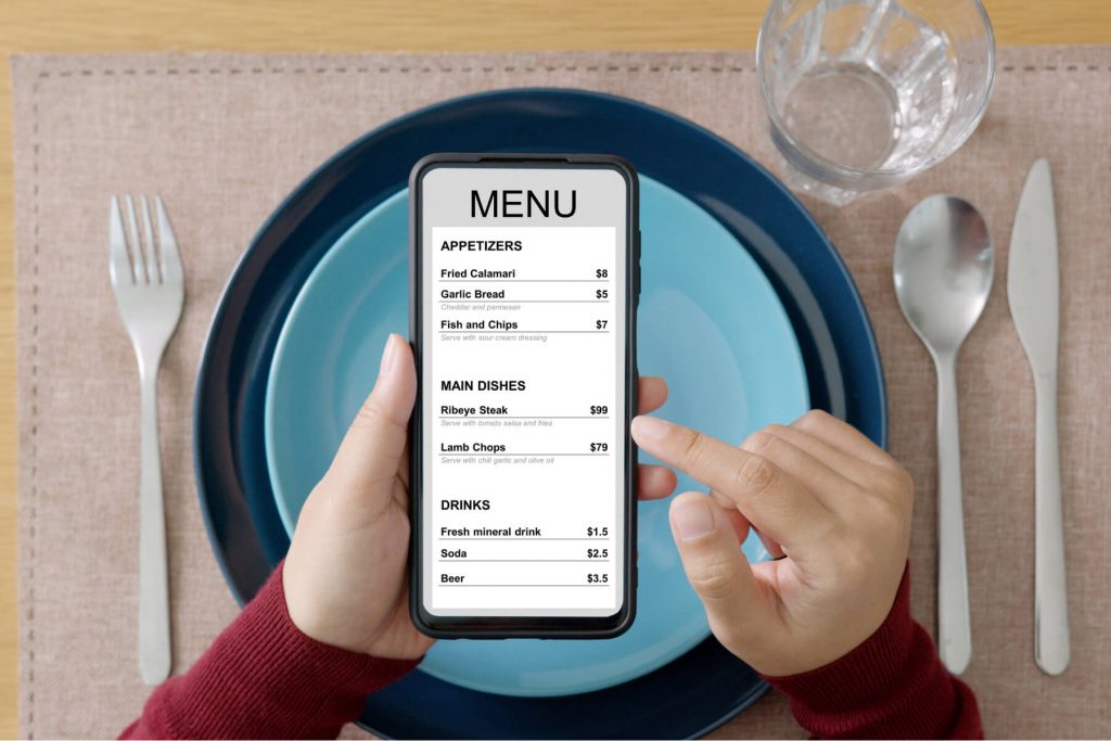
The pandemic of 2020-2021 has changed how people think about ordering food. Many restaurants adapted to a new market environment by creating new mobile applications or upgrading their existing apps to make it easier for their customers to place online orders.
Overall, mobile commerce sales grew at an impressive 34.1% annual growth rate in 2020. In comparison, US total retail sales increased at a modest rate of 2.2%.
Food and Beverage Ecommerce Revenues in the US

The food and beverage e-commerce revenue increased by 50% in 2020, from 17.4 to 26.1 billion dollars, and by another 31.3% in 2021, reaching 34.2 billion dollars. The Statista Digital Market Outlook expects food and beverage e-commerce revenue to keep rising in the next few years to get to a projected 47.6 billion dollars by 2025, a 39% growth rate from its current position.
Nowadays, restaurant owners realize the vital importance of high-quality app design. When customers download your app, they expect a convenient and easy food-ordering experience. This article explores the best practices in restaurant app UI design. We will go over the essential features of a food-ordering app and the process of designing a successful restaurant application.
What is Restaurant App UI Design?
Restaurant mobile app UI design involves creating an attractive graphical interface that reflects your branding message and helps to establish an emotional connection with your customers. The main focus of UI designers is to ensure an effortless and enjoyable user experience.
Custom-made illustrations, animations, micro-interactions, and gestures increase user engagement and distinguish your restaurant from the competition. Overall, high-quality UI design consistently creates a pleasant food-ordering experience and builds your brand loyalty.
There are three main types of restaurant applications:
1. New Restaurant App

The main objective of a new restaurant app for a new or existing location is to strengthen brand awareness and reach new or existing customers through the mobile channel. These goals can be achieved by focusing on easy onboarding and a strong branding message.
2. Upgrade of an Existing Restaurant App
Improving an existing app is usually based on a good understanding of your customers’ needs and preferences. The aim here is to enhance their experience with an app and introduce new features, such as curbside pick-up.
3. Food Delivery App

There are two types of food delivery apps:
1. Aggregator
The aggregator app enables users to browse local restaurants and look at their menus and reviews. The customer creates an account, searches for a restaurant, makes a selection, and places an order. The aggregator app connects the two parties, and the restaurant takes care of the delivery. Zomato and Swiggy are examples of food delivery aggregators.
2. Delivery Service App
Delivery service app functions almost like the aggregator model, only with one exception. The application platform handles the delivery. It is more convenient for smaller restaurants that can save money on the delivery system for their orders, and UberEats and Doordash use this business model.
Essential Features of Mobile App UI Design
What does it take to create a great restaurant app UI design in 2022? Before you start designing your app, it’s crucial to determine which features it will have. Depending on the type of restaurant app and how it’s going to be used, it may need to include the following features:
- Features for Admin
- Features for Users
- Features for Delivery Driver
- Features for Kitchen
Essential features of mobile app UI design can vary depending on the type of restaurant app and its intended use. If you are unsure which features to include, an experienced app design and development team can determine the right mix of features for your specific business.
The lists below show the most commonly used restaurant app user interface design features for admin/restaurant managers, users, kitchen, and delivery drivers.
1. Features for Admin/Restaurant Manager
- Reports and analytics: total performance indicators per period and per person
- Delivery tracking
- Customer management
- Staff management
- Kitchen management
- Restaurant reviews
- Social media integration
- Personalization
- Order management
- Menu management
- Scheduling
- Food items management
2. Features for Users
- User Profile: customized dietary requirements or food intolerances
- Restaurant Search/Listings
- Menu
- Easy checkout process: automatic payments, card registration
- Order/Delivery Status
- Easy to reorder
- Order ahead of time
- Loyalty programs
- Bill splitting
- Mobile wallet integration
- Automatic tipping & tip addition
- Email/print receipts
- Feedback: asking for review or rating for quality control and improvement
- Conflict resolution and error handling procedures
3. Features for Kitchen
- Taking and processing orders
- Food items management
- Personnel management
4. Features for Delivery Driver
- Driver onboarding process
- Scheduling and availability
- Dark mode
While deciding on your restaurant app UI design features, it’s crucial to consider their feasibility and integration into other business processes.
Here are a few questions to consider here:
- Is it feasible to implement the app features?
- How to integrate this app into other technologies (such as the point of sale) and other business processes?
- Does the interface on the POS and on the app match for convenience?
- When kitchen employees identify that they run out of an item who else should know about it; and how is it going to be communicated?
Steps in Designing a Restaurant Mobile App
Step 1. Discovery and Knowledge Transfer
Designing a restaurant app begins by sharing all the information and clarifying goals and expectations about the app.
Step2. Defining User Personas
At the initial stage, it’s essential to understand your user persona thoroughly. A user persona is a brief demographic portrait of your typical customer.
Step 3. Mapping User Journeys
Then you can efficiently map out the steps that your typical customer takes from the moment they download your app to the moment they share their feedback after enjoying their order.
Step 4. Planning User Stories
User stories describe each app feature from the point of view of your typical customer. Different team members can then use these descriptions to understand which activities, steps, and details are associated with each feature. They can easily see the big picture and participate in conversations.
Step 5. Creating UX Wireframes
Based on the information gathered at each step, UX designers create wireframes of all product screens. Since it’s a light version, new iterations can be easily implemented.
Step 6. UI Design
Finally, UI designers create an attractive graphical interface that builds an emotional connection with your app users. High-quality UI design creates a memorable experience for your customers and builds their confidence in your brand.
Step 7. Creating a Prototype
All wireframes are connected into an interactive prototype that can be user-tested and then passed on to the development team.
Restaurant App UI Design Examples
Every restaurant app is unique and, therefore, requires a unique approach. Here are our restaurant app UI design
For a food delivery service app, it’s important to consider negative order flows and consider the logistics details. What is the procedure for canceling an order? Is it possible to schedule the delivery of your order for a specific date and time? What is a process for updating the menu when an item is unavailable?
For a highly technological food delivery app with many advanced features, it is essential to establish excellent communication with the development team early in the project. The role of the product manager is to clarify all the business specs, match them to development feasibility, and deliver user stories that are used by the whole team.
A restaurant application for an existing brand requires a strong UX designer to think through and integrate the new features into an existing app structure, while the UI designer’s objective is to maintain the existing brand colors. A motion designer can create neat transitions.
Bite&Bite

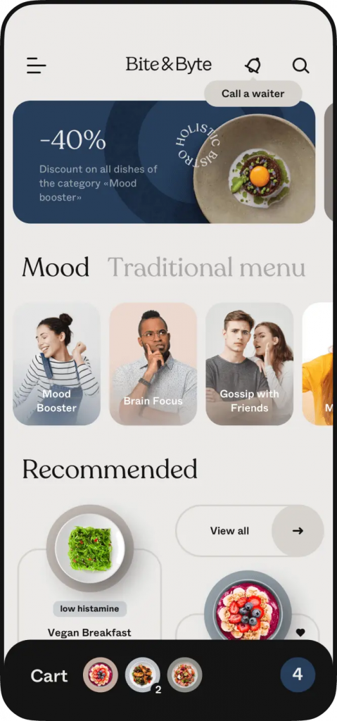
One example of a mobile UI/UX design for an existing restaurant our team has created is Bite&Bite, a holistic restaurant in Europe. The app was designed to place dine-in or to-go orders. Given Bite&Bite’s novel approach to ordering food, which is based not only on their customers’ dietary preferences but also on their mood, efficiently displaying every food item with its detailed nutritional information was our priority. Using different font sizes and font colors, we assigned importance to various elements on the screen.
Since Bite&Bite’s clientele includes health-conscious professionals with a dynamic lifestyle, each product page was designed using high-quality images to make it easier for customers to perceive nutritional and visual information and place an order.
Product recommendations are offered when a customer chooses between Traditional Menu and Mood Menu categories.
The checkout process is simplified because clients complete a quick registration process and provide their dietary preferences when they download the app. Payment methods include a credit card, PayPal, and Apple Pay.
Customers are asked to leave a tip for their waiter on the last step.
Consider Tino Agency Your Trusted Partner
As a full-service design agency located in Houston, we help our clients define, design, and develop powerful user experiences. Our proven human-centered design process consistently delivers user-friendly and engaging digital products for our customers. We develop full-fledged mobile and web applications with front-end, back-end services, and third-party integrations. We also build and redesign static websites. We are proud of our client’s success and would love to assist you in reaching your business goals.
If you would like to estimate the cost of developing a mobile app for your restaurant, please refer to our article on How Much Does It Cost to Build a React Native App: React Native App Development Cost in 2021.
If you have an idea for a restaurant app and would like to discuss it with our experts, feel free to drop us a line at info@tino.agency , and we’ll be happy to assist you.
Final Thoughts
In recent years, food and beverage e-commerce revenues have been expanding and are expected to keep growing in the coming years. While more customers are switching to mobile food-ordering, restaurant owners realize the importance of adopting the best UI design practices for their mobile apps. High-quality mobile user interface design naturally leads to stronger customer loyalty and greater brand awareness.
This article discusses essential features of the app UI design for a restaurant or food delivery service and describes how to design a restaurant app UI. We provide specific examples of restaurant app UI designs to help you get started on your app. Since every business is unique, an experienced app design and development team can determine the right mix of features for your specific restaurant app.
FAQ
Restaurant application UI design involves creating an attractive graphical interface that reflects your branding message and helps to establish an emotional connection with your customers. The focus of UI designers is to ensure an effortless and enjoyable user experience.
Essential features of mobile app UI design can vary depending on the type of restaurant app and its intended use. Depending on the restaurant app type and how it’s going to be used, you may need to include features for admin/restaurant owner, app users, kitchen, and delivery driver. If you are not sure which features to include, an experienced app design and development team can determine the right mix of features for your specific business.
